Chapter 3: Presenting information
Chapter learning objectives
Upon completion of this chapter you will be able to:
- prepare written reports representing management information in suitable formats according to purpose
- present information using tables, charts and graphs (bar charts, line graphs, pie charts and scatter graphs)
- construct scatter diagrams and lines of best fit
- interpret information (including the above tables, charts and graphs) presented in management reports.
1 Introduction
The major theme underlying management accounting is information.The previous chapter dealt with the processes involved in collectingthat information – this can be seen as the input into the managementaccounting process. We now turn our attention to the output from themanagement accounting department – the presentation of information tomanagement.
One of the desirable qualities of information is that it should beunderstandable to the user. Management accountants have been criticisedin the past for presenting information in a form which is unclear to thenon-expert. Very often, graphical methods of presentation are clearerto the user than written or numerical presentation.
2 Writing reports
 The information given below on writing reports can be applied, in notonly a business environment, but also in an examination environment.
The four-stage approach to report writing
When producing written reports, the management accountant needs to carry out four steps.
Prepare
- determine the type of document required: detailed report, short memo, discussion notes, etc.
- establish the user of the information: language used and knowledge assumed will be largely determined by the recipient.
- find out what the report will be used for – the report will often be aimed at providing information to help management make a decision.
Plan
- select the relevant data: summarise, analyse, illustrate (if appropriate) to turn the raw data into useful information. This will often involve the use of management accounting techniques
- produce a logical order for the material.
Write
- determine the writing style which is appropriate
- take care over spelling, use of English and arithmetic – your meaning must be clear and logical.
Review
- re-read what you have written
- check that it meets the requirements of the document
- ensure that it is complete and clear.
The structure of a report
A typical report structure will be as follows:
- Title – At the top of your report show who the report is to, who it is from, the date and a heading.
- Introduction – showing what information was requested, the work done and where results and conclusions can be found.
- Analysis – presenting the information required in a series of sub-sections.
- Conclusion – including, where appropriate, recommendations. Never introduce new material into a conclusion.
- Appendices – containing detailed calculations, tables of underlying data, etc. If you use appendices refer to them in your report.
Numbered headings and cross referencing between sections make reports easier to follow (or navigate).
Use of English
English is technically a complicated language – if you try to write lengthy complex sentences or paragraphs, it may go wrong.
The single most important point is to make sure that the reader can understand what you are saying.
Some specific guidelines are:
- avoid excessively long sentences – they are difficult to follow
- avoid over-long words
- do not use jargon, clichés, metaphors – the aim is to communicate in a professional manner
- if acronyms (e.g. ACCA) are used – they should be explained the first time they are introduced into the report
- take care with punctuation and grammar to make sure your ideas are communicated clearly.
3 Tables
 Tabulation is the process of presenting data or in the form of a table – an arrangement of rows and columns.
The purpose of tabulation is to summarise the information and present it in a more understandable way.
Rules of tabulation
The following rules or principles of tabulation should be borne in mind when preparing tables:
(a) Title: the table must have a clear and self-explanatory title.
(b) Source: the source of the material used in drawing up the table should be stated (usually by way of a footnote).
(c) Units: the units of measurement thathave been used must be stated e.g. 000s means that the units are inthousands. This can be done in the title, to keep the number of figuresto a minimum. Alternatively this could be done in the column headings.Failure to do this can make the table extremely misleading.
(d) Headings: all column and row headings should be clear and concise.
(e) Totals: these should be shown where appropriate, and also any subtotals that may be applicable to the calculations.
(f) Percentages and ratios: these aresometimes called derived statistics and should be shown, if meaningful,with an indication of how they were calculated.
(g) Column layout: for ease ofcomparison columns containing related information should be adjacent andderived figures should be adjacent to the column to which they refer.
(h) Simplicity: the table should be as concise as possible.
(i) Layout: wherever possible ensurethat the table is set up so that there is no need to turn the page. Thiswill affect the choice of columns and rows.
Columns and rows
A table is set up in the form of a number of columns headed upacross the page and then a number of rows of information moving down thepage. A typical table would be set up as follows:

Therefore the table is capable of showing only two variables, onewill be shown in the columns and one in the rows. A key element ofsetting up a good table is to decide upon the optimal arrangement ofcolumns and rows.
Three general rules apply here.
(1) Try to ensure that the page does notneed to be turned onto its side. This will generally be done bychoosing the minimum number of columns.
(2) The columns should be arranged so that related information is shown alongside each other.
(3) The information shown in the rowsshould be arranged so that there is a logical progression through theinformation and any meaningful totals or subtotals can be clearly made.
4 Graphs and charts
In some cases clarity of presentation can be improved if data ispresented pictorially – in the form of charts or graphs. We shallrefer to these two techniques together as diagrams.
A diagram should be as clear and unambiguous as possible. In orderto help to achieve this aim a number of rules should be followed:
- give each diagram a name or a title
- state the source of any data that has been used
- state the units of measurement that have been used
- give a scale so that the diagram can be properly interpreted
- ensure that the presentation is neat
- use a key to explain the contents
- if axes are used, they should be properly labelled.
These guidelines are similar to those suggested above for the construction of tables.
The types of diagrams which are covered by your examination syllabus are:
- bar charts
- line graphs
- pie charts
- scatter graphs.
Bar charts
A bar chart is a widely used method of illustrating quantitativedata. There are a number of different types of bar chart and the ones tobe considered in this chapter are:
- simple bar charts
- component (or stacked) bar charts
- percentage component bar charts
- compound (or multiple) bar charts.
(1) Simple bar charts
A simple bar chart is where one variable only is being illustrated. The bar chart is drawn using the following steps:
Step 1 Draw up the two axes and clearly label them withthe scale to be used and a description of each bar. Ensure that thescale on the vertical axis starts at zero as, if it does not, the visualeffect of the chart will be incorrect.
Step 2 Give the bar chart a title and note the source of any data.
Step 3 Draw bars with equal widths with their heights representing the relevant amount of the variable.

 Illustration 1
The production of grain in the UK for the years 20X1 to 20X3 was as follows:

Illustrate this data using a simple bar chart.
A bar chart showing the production of grain in the UK from 20X1 to 20X3
Interpretation
A simple bar chart shows not only the actual amount of the datawhich can be read off from the vertical axis but also the relationshipbetween the data.
In the example the actual amount of wheat production each year canbe determined by reading off the amounts on the vertical axis. It isalso possible to see at a glance that wheat production was increasing bysignificant amounts over the three-year period.

(2) Component bar chart
A component bar chart is used when each total figure in the datais made up of a number of different components and it is important thatthese component elements are shown as well as the total figure.

 Illustration 2
Continuing with the previous grain production example suppose thatannual production can now be split into that of rye, wheat and barley asfollows:

Draw a component bar chart to illustrate this data.
It helps to produce cumulative totals for each type of grain as shown below:
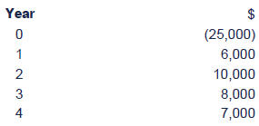
A bar for each year can now be drawn showing the amount for each grain.
Grain production in the UK, 20X1 to 20X3
Interpretation
The component bar chart still shows that the volume of grain as awhole has been increasing by significant amounts but it also shows thebreakdown of this information into types of grain.

(3) Percentage component bar chart
A percentage component bar chart is one where the actual valuesof each component are not shown but the percentage of the total for eachcomponent is. The bars in this type of chart are all the same height(representing 100%) and are split according to the proportions of eachcomponent element – rye, wheat and barley in our example above.

 Illustration
To create a percentage component bar chart you need to calculate the percentage of the total that each variable takes up.
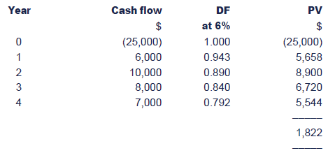
Convert the above figures into percentages:
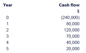
Show these on a percentage component bar chart.
A bar chart showing the percentage of grain produced from 20X1 to 20X3
Interpretation
From the percentage graph it is clear to see that even though thetotal amount of grain produced is increasing – the proportion of thedifferent types of grain is remaining fairly constant.

(4) Compound (multiple) bar charts
Compound bar charts are sometimes termed multiple bar charts. Acompound bar chart is one where there is more than one bar for eachsub-division of the chart. For example if the sales per product for eachyear are given then for each year there could be a separate bar foreach product.
This has obvious similarities to a component bar chart where eachcomponent of the total was shown as part of the total bar. However thedifference here is that each component has its own bar and is notstacked. It is a suitable format if the total of each component of thebar chart has no significance.

 Illustration 3
An accountancy tuition provider uses a delivery company to deliverits book and manuals to customers and retailers. Using the followinginformation construct a compound bar chart to show how the followingvariables have changed over the last 3 years.
(a) the sales value of the manuals and text books sold
(b) the van expenses
(c) the drivers wages
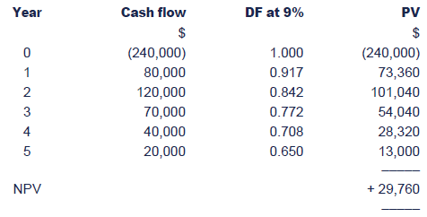
A compound bar chart showing the sales value, the van expenses and the drivers wages for years 1 – 3
Interpretation
This compound bar graph has been used to show how the value of 3different items has changed over time. It is clear from the graph thatsales have grown and in comparison van and driver expenses have stayedalmost static.

Line graphs
In many instances it will be found that data can be more clearlyand understandably presented in the form of a line graph, especially ifwe are consider the change in an item over time. There are a number ofrules concerning the construction of a graph, similar to those we haveseen earlier in the chapter for other types of diagrams. These aresummarised below:
- Graph paper – where accuracy is required in an exam, you should always use graph paper to draw a graph. The graph paper makes both the drawing and the interpretation of the graph easier.
- Title – The purpose of a graph is to provide information therefore it is important that all graphs have a title to explain what it is that they are showing. If the source of the information shown on the graph is also known then this should also be shown on the graph.
- Axes of a graph – A graph has two axes known as the x axis and the y axis. The x axis is always the horizontal axis and the y axis the vertical axis.
Independent and dependent variables
It is important that the correct variable is plotted on each axis.The dependent variable must always be plotted on the vertical (y) axisand the independent variable on the horizontal (x) axis.
If we wanted to look at how sales have changed over a given timeperiod then the sales volume would be plotted on the y-axis and the timeperiods (months) on the x-axis. The sales are dependent on the monthrather than the sale determining the month. The month of the year isindependent of the sales volume – March will become April no matterwhat is happening with sales.
You could think in terms of the x-axis being the cause, and the y-axis the effect.
Each axis must be labelled and the units used must be stated e.g. $000, years, hours, miles, etc.
Scales of the axes
Once the variables that are to be plotted on the x and y axis havebeen determined then the next step is to decide upon the scale that isto be used on each axis. There are four guidelines to remember here:
- Try to fill as much of the page of graph paper as possible. A tiny graph on an A4 sheet not only looks ridiculous but it is also difficult to draw and interpret.
- Use sensible numbers for the scale such as 1cm = 1, 2, 5 or 10 units rather than 3 or 7 units. Again this makes the graph easier to draw and to interpret.
- There is no necessity for the same scale to be used on each axis. Even if the units on the x and y axis (for example $s) are the same a different scale is quite permissible.
- The scale must be consistent. For example if the scale on the x axis starts at 1 cm = $100 then it must not change to 1 cm = $1,000 part way along the axis.
Starting point of axis – In most cases the scales on both axes should start at zero.
However in some circumstances this is just not practical. Forexample if the items to be plotted on the y axis are $4,600, $4,900 and$5,000 then it would not be practical to start the scale at zero. Insuch a case it is permissible to show a break in the scale with a zigzag line.
Plotting the graph
Once the axes and the scale of the graph have been determined thenit is simply a matter of plotting the points accurately on the graph.The points on the graph can then be joined together. This will usuallybe done with straight lines although in some instances curves may beused if figures in between the points are to be read off. However, as ageneral rule, join the points with straight lines.
Multiple line graphs
You may be required to plot more than one set of variables on thesame graph. This is quite acceptable as long as the graph still remainsclear and informative. Remember that the purpose of a graph is toillustrate information clearly.
If more than one line is to appear on a graph then they must alsobe drawn to the same scale and the different lines should be clearlyindicated by use dashed or dotted lines or coloured lines.

 Illustration 4
You are an accountant working for a group of companies. In onesector of the business there are two divisions, A and B. Some concernhas been expressed in recent years regarding the growth inadministrative costs in the two divisions.
Details of administrative costs for the past five years are:
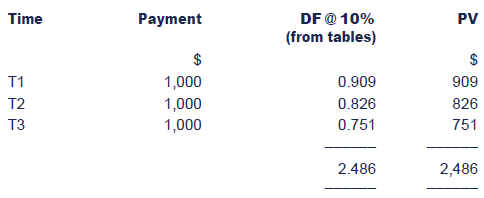
Draw a line graph to show the administrative costs for bothdivisions at both original and adjusted prices for the period from 20X1to 20X5.
Interpretation
From the graph, it can be seen that the rise in Division B costs is steeper than in A, in both the actual and adjusted costs.

Scatter Diagram
Information about two variables that are considered to be relatedin some way can be represented on a form of graph known as a 'scatterdiagram', each axis representing one variable. For example, the amountof rainfall and the crop yield per acre could be plotted against eachother, or the level of advertising expenditure and sales revenue of aproduct, or the level of electricity cost and the number of unitsproduced.
The values of the two variables are plotted together to show anumber of points on the graph. The way in which these are scattered ordispersed indicates if any relationship is likely to exist between thevariables.
Line of best fit
When the points on a scatter diagram lie in a narrow band, there isa strong relationship between the variables. This band may be curved orstraight – we shall deal only with the straight relationship, whichindicates a linear relationship.
To obtain a description of the relationship between two variablesin the form of an equation in order to forecast values, it is necessaryto fit a straight line through the points on the scatter diagram whichbest represents all of the plotted points. There are several ways ofaccomplishing this.
One method is simply to fit a line 'by eye' which appears to suit all the points plotted.
When we have our line of best fit drawn on the scatter diagram, wecan use it to see if there is a positive or negative relationship.
Scatter diagrams with lines of best fit can be useful as aforecasting technique and has the advantage of relative simplicity –this is looked at in more detail in a later chapter.

 Illustration 5
Consider the following data which relates to the total costs incurred at various output levels in a factory:
If the data shown above is plotted on a scattergraph and a line of best fit is drawn on it would look like this:
A scatter graph showing the relationship between output and cost
Interpretation
It is clear to see from the line on the graph that there is apositive relationship between output in units and costs ($). As outputincreases the costs also increase.

Pie Charts
Pie charts are used to illustrate different components of data as part of a whole, similar to percentage component bar charts.
A pie chart is a circle broken down into wedges, each wedge representing a component of the data.
Constructing a pie chart
(1) Calculate the total value of all components of the numerical data
(2) Convert each component of data into “degrees†of the circle using the following formula:
360Ëš/Total value of data = Number of degrees per unit
(3) Calculate the size of wedge required to represent for each element of data
(4) Draw a full circle and split it into wedges accordingly

 Illustration 6
Suppose a family's income in 20X0 is £1,000 per month, and their expenditure splits down as follows:

The pie chart would look like this:
A pie chart showing how the family's income is spent
Interpretation
It is not possible to read actual figures from this pie chart butit is very easy to see what the largest proportion of the familiesincome is spent on. Over a quarter of the income is spent on themortgage and insurance, with food and drink the next biggest section.

Interpretation of tables, charts and graphs
Although the information presented in diagrammatic form should bepresented in a way which is easy to understand, part of the role of themanagement accountant may nevertheless involve interpreting theinformation, perhaps in the form of a brief report to management.
It will generally be the case that the better prepared the diagramis, the less the interpretation that will be required to assistmanagement to understand the information.
Your objective in carrying out this sort of interpretation exerciseis to bring out the meaning in the information and, perhaps, to helpmanagement reach conclusions based on the information presented. As aresult of your interpretation, you may also be able to make suitablerecommendations to management, if required by the question.
5 Chapter summary
|
Created at 5/24/2012 5:05 PM by System Account
(GMT) Greenwich Mean Time : Dublin, Edinburgh, Lisbon, London
|
Last modified at 5/25/2012 12:53 PM by System Account
(GMT) Greenwich Mean Time : Dublin, Edinburgh, Lisbon, London
|
|
|
|
 |
Rating
:
|
 Ratings & Comments
(Click the stars to rate the page) Ratings & Comments
(Click the stars to rate the page)
|
 |
Tags:
|
|
|
|
|